Redesigning Critical Shopping
Journeys for a Food E-commerce Platform
A focused redesign of
four
high-impact pages to improve product discovery, reduce checkout friction, and
create a more modern shopping
experience without rebuilding the entire platform.
Hogar Foods is an online platform that offers a variety of
traditional food products through an e-commerce website.
While the platform provided access to a wide range of
products, the existing interface lacked clear visual hierarchy and consistency, making the browsing experience
feel cluttered and outdated.
This project focuses on improving the UI structure, layout,
and visual hierarchy of key browsing pages to create a cleaner and more engaging shopping experience.
Team
I worked as a UI/UX Designer, collaborating closely with the
Hogar Foods team to elevate the core purchase experience, creating a cleaner and more consistent interface across
high-intent stages.
The client already had a functioning e-commerce platform.
However, several core pages had become visually inconsistent and difficult to scale. Rather than redesigning the
entire website, the goal was to improve the parts that had the highest impact on user shopping behaviour.
The redesign focused on improving usability while preserving
familiar workflows for existing customers.
Existing experience had several usability gaps
After reviewing the existing experience, I identified
recurring issues across the selected pages.
Key Observations
Product Discovery
Users needed more effort to browse products and compare
options.
Visual Hierarchy
Important actions competed visually with secondary
information.
Checkout Clarity
Cart information lacked prioritization.
Consistency
Different pages felt disconnected from each other
Product Listing UI Redesign
The original product listing page was functional but
visually dense. Product information, actions, and categories competed for attention, making scanning and
browsing slightly difficult.
The redesign focused on cleaner product cards, clearer
action hierarchy, and improved layout spacing to make the browsing experience more structured and comfortable.
Design Approach
The goal of this redesign was not to change the product flow
but to refine the visual structure of the interface.
By improving hierarchy, spacing, and component consistency,
the page now allows users to scan products faster and focus on key information like product image, price, and
actions.
Key Improvements
Clearer Product Card Structure
The original layout lacked strong visual separation
between products. The redesigned cards introduce defined containers, improved spacing, and consistent
alignment, making each product easier to scan.
Better Action Hierarchy
Previously, the purchase actions had similar visual
weight. The redesign establishes a clearer hierarchy by introducing a stronger primary action and a more
supportive secondary action.
Improved Category Navigation
Category filters were visually subtle in the original
interface. The updated design enhances the active state and spacing, making category switching more
discoverable.
More Balanced Layout
Spacing between elements and product cards has been
refined to reduce visual density and create a more comfortable browsing experience.
Cart & Checkout UI Redesign
The original cart page presented the necessary information
but lacked structure and clarity. Product details, pricing information, and checkout actions were visually
separated, making it slightly harder for users to quickly understand their order and proceed to checkout.
The redesign focuses on creating a clearer checkout flow by
grouping related information, improving visual hierarchy, and introducing structured sections for address
management and order summary. This helps users review their order, manage delivery details, and complete the
purchase with less cognitive effort.
Design Approach
The goal of this redesign was to simplify the checkout
process and make key actions more prominent. Instead of presenting the cart as a simple product list with
totals, the interface was reorganised into two clear sections: Address Management and Order Summary.
This structure guides users through the final steps of the
purchase process confirming delivery details and reviewing their order while maintaining a clear visual
hierarchy and consistent component design.
Key Improvements
Structured Checkout Layout
The redesigned interface introduces a two-column layout
that separates delivery information from the order summary. This structure helps users quickly understand
the checkout flow and reduces visual clutter.
Integrated Address Management
Users can now view saved addresses, add new ones, edit
existing entries, and set a primary address directly within the checkout screen. This reduces friction and
removes the need for additional navigation steps.
Clearer Order Summary
Product details, pricing, and quantity controls are
organised into a concise order summary section. This allows users to easily review items and make quick
adjustments before confirming the order.
Stronger Action Hierarchy
Primary actions such as Confirm Order are highlighted
using stronger visual emphasis, guiding users naturally toward completing their purchase while secondary
actions remain accessible but less dominant.
More UI Improvements
Along with the major redesigns, several other screens were
refined to improve usability and visual consistency.
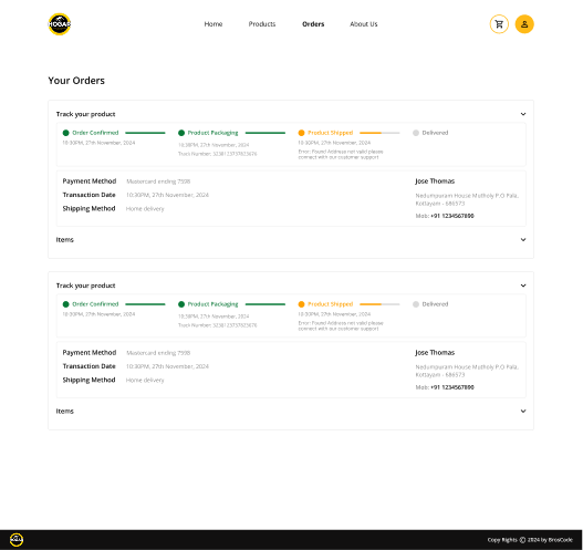
Orders Page UI Redesign
Orders Page UI Redesign
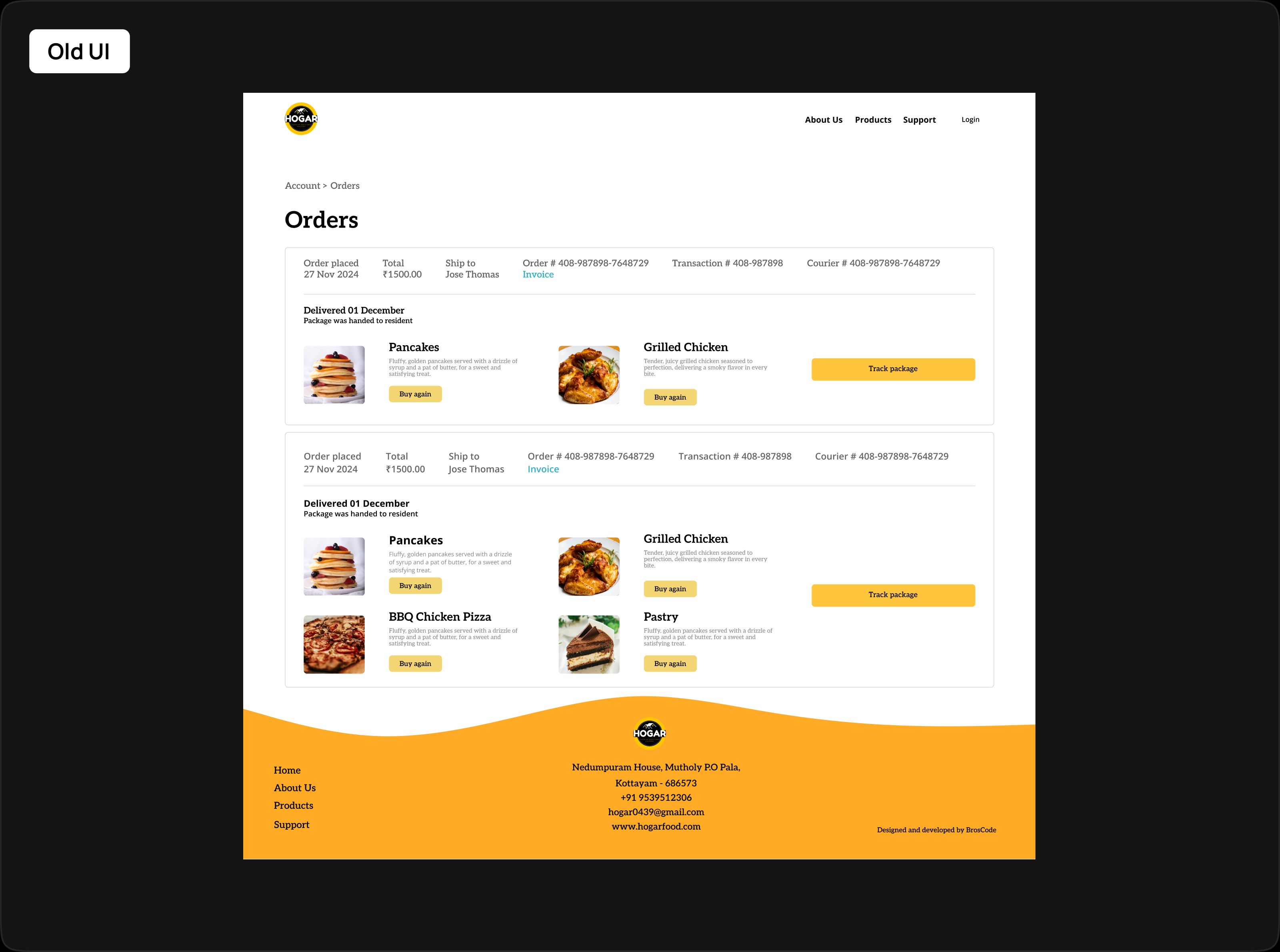
The original orders page contained all necessary
information but lacked structure and prioritisation. Order details, tracking information, and actions were
visually mixed, making it difficult for users to quickly understand their order status or take action.
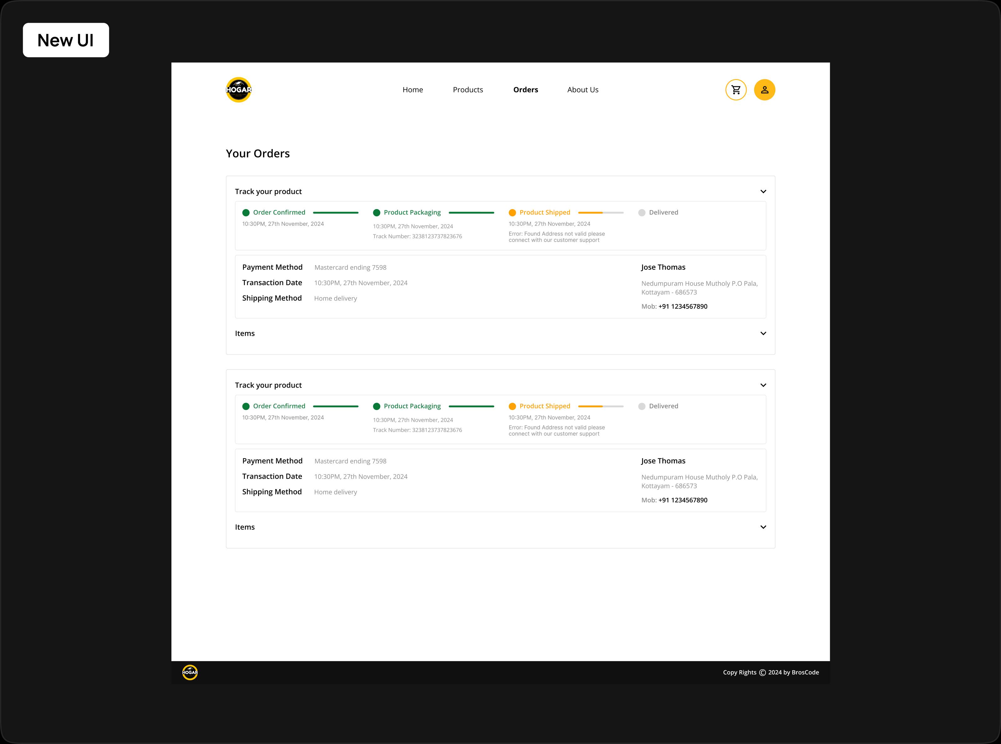
The redesign focuses on creating a clearer order
experience by separating tracking, order details, and actions into structured sections. This helps users
quickly check status, review items, and take actions like tracking or reordering with minimal effort.
Design Approach
The goal of this redesign was to improve clarity,
scannability, and actionability in the orders experience.
Instead of presenting all information in a single
dense layout, the interface was reorganized into:
Order Tracking Section shows real-time progress
Order Details Section payment, address, and metadata
Items Section collapsible list of purchased items
This structure guides users through the final steps of
the purchase process confirming delivery details and reviewing their order while maintaining a clear
visual hierarchy and consistent component design.
Key Improvements
Structured Order Layout
The redesigned interface introduces a modular
card-based layout that separates tracking, details, and items into clear sections. This improves
readability and reduces clutter.
Visual Order Tracking
A step-based progress indicator (Order Confirmed →
Packaging → Shipped → Delivered) provides clear visibility into order status, allowing users to
understand progress at a glance.
Progressive Disclosure
Detailed information such as items and metadata is
hidden under collapsible sections. This keeps the UI clean while still making all information
accessible when needed.
Stronger Action Hierarchy
Primary actions like Track Order and Buy Again are
visually emphasised, making it easier for users to take quick actions without searching.
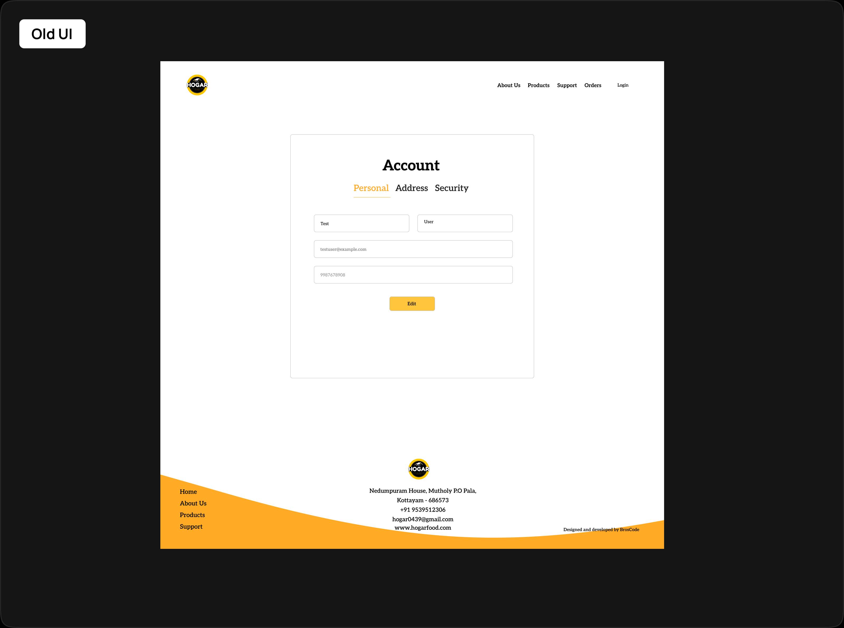
Account Page UI
Redesign
Account Page UI Redesign
The earlier account screen relied on a tab-based
layout (Personal, Address, Security), which limited visibility and required users to switch between
sections to complete simple tasks.
While the functionality existed, the experience felt
fragmented and slow, especially when users needed to update details and manage addresses together.
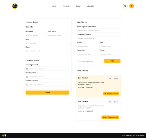
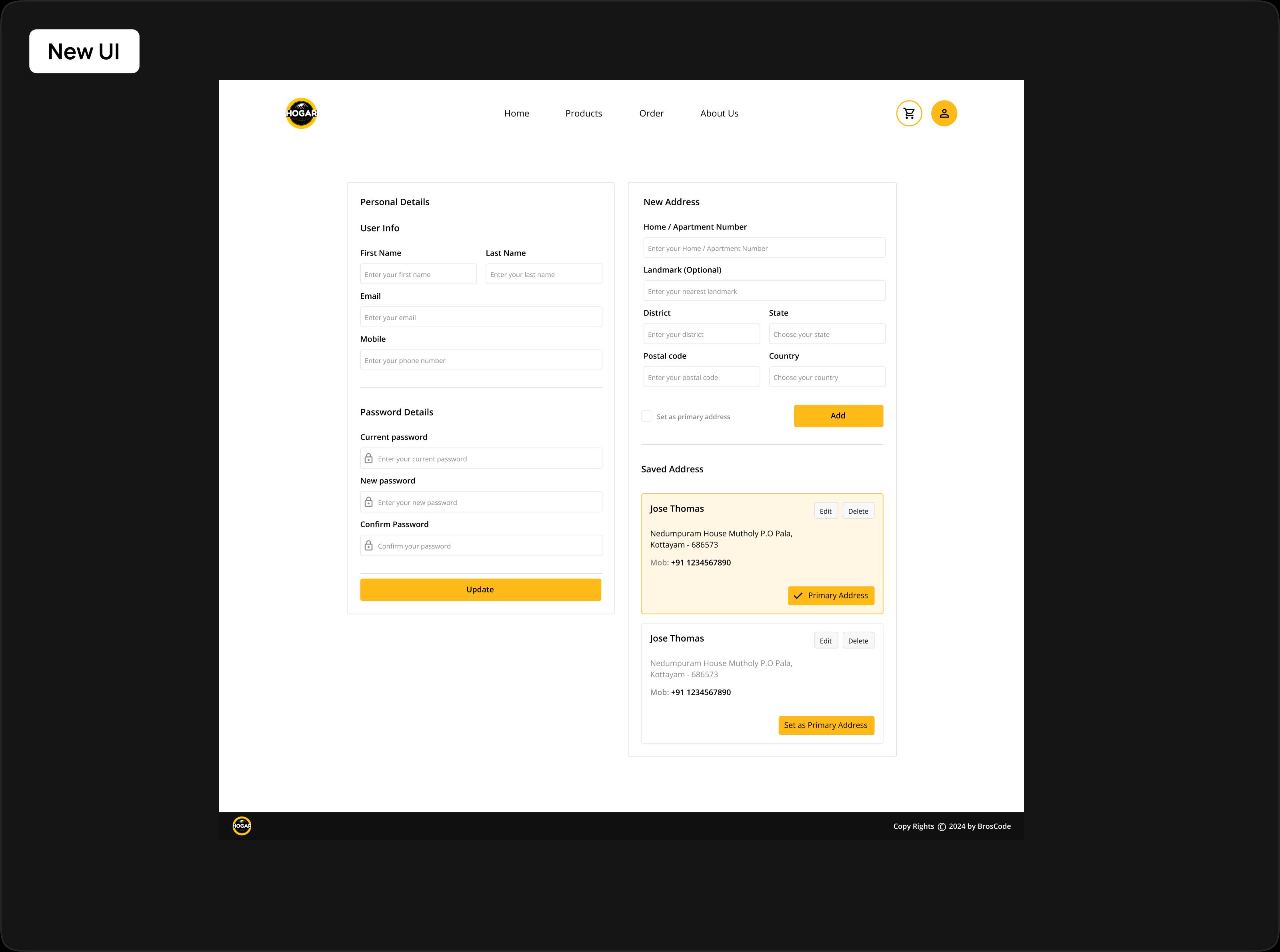
The redesign focuses on bringing everything into a
single, structured workspace, allowing users to manage their account without unnecessary navigation.
Design Approach
Instead of thinking in “pages”, the redesign shifts to
task-based grouping.
The layout was restructured into parallel workflows:
User Information & Security → left side
Address creation + saved addresses → right side
This allows users to:
Update profile and address in the same flow
View existing data while making changes
Avoid switching contexts
“Everything related to your account should be visible
and actionable in one place.”
Key Improvements
Always Visible Sections
Instead of hiding content inside tabs, all
critical sections are now visible together. Users no longer need to navigate back and forth to manage
their account.
Real-Time Address Workflow
Users can add, view, and set a primary address
within the same space, making address management faster and more seamless.
Clear Form Segmentation
User details are split into basic info and
password updates, helping users focus and reducing confusion.
Action-Driven Design
Actions like Add, Update, Edit, Delete, and Set as
Primary are placed contextually, making interactions quick and intuitive.
.jpg)
.jpg)
.jpg)
.jpg)